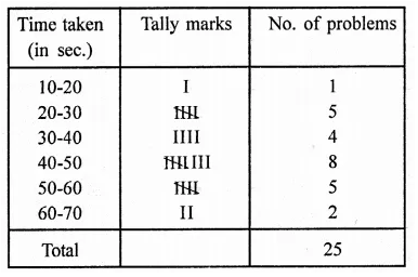
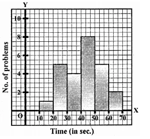
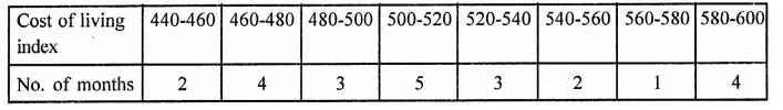
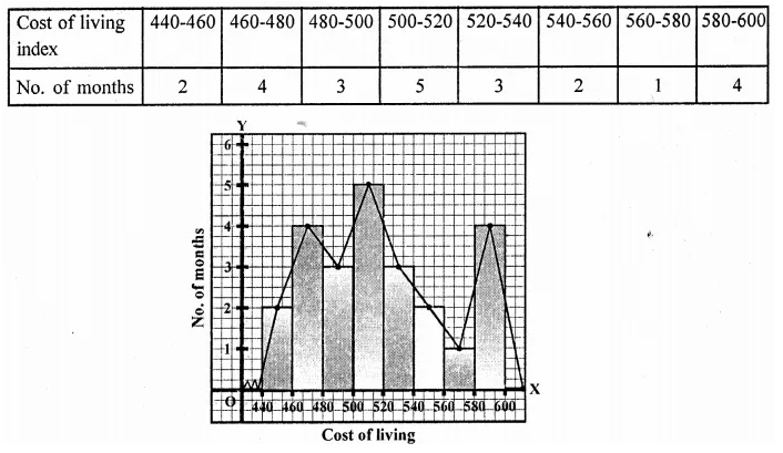
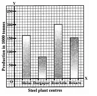
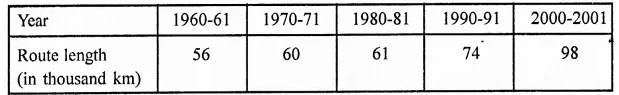
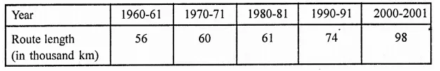
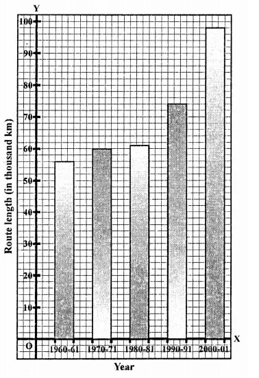
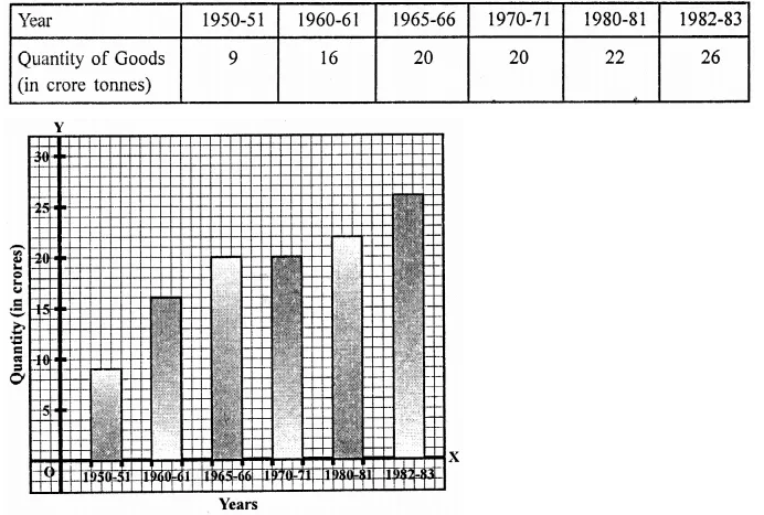
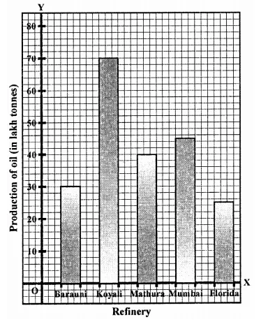
RD Sharma Class 8 Solutions Chapter 25 Data Handling III (Pictorial Representation of Data as Pie Charts or Circle Graphs) Ex 25.2
These Solutions are part of RD Sharma Class 8 Solutions. Here we have given RD Sharma Class 8 Solutions Chapter 25 Data Handling III Ex 25.2
Other Exercises
- RD Sharma Class 8 Solutions Chapter 25 Data Handling III Ex 25.1
- RD Sharma Class 8 Solutions Chapter 25 Data Handling III Ex 25.2
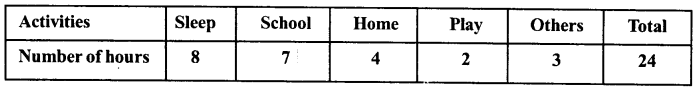
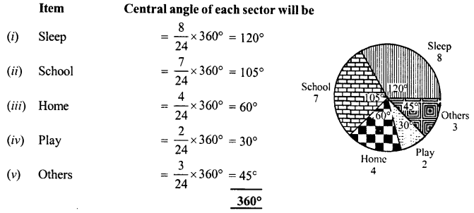
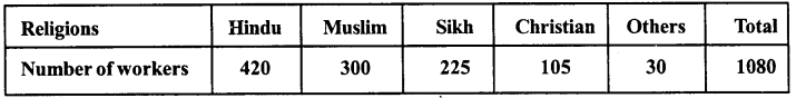
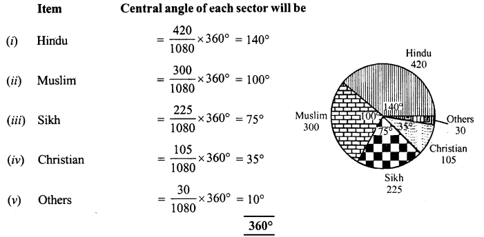
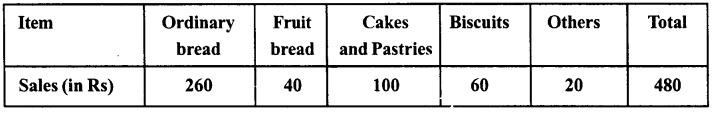
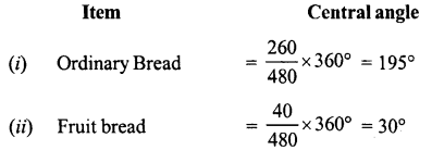
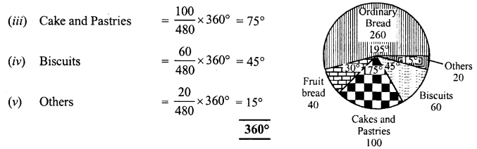
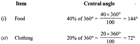
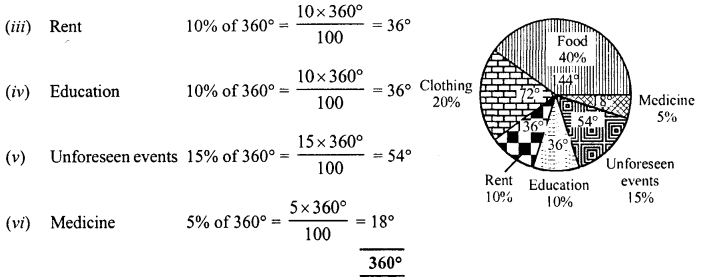
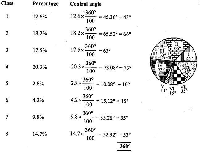
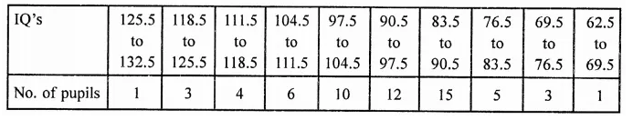
Question 1.
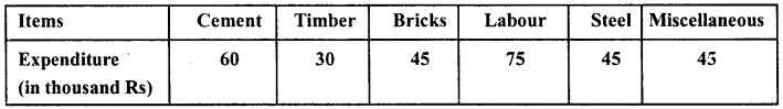
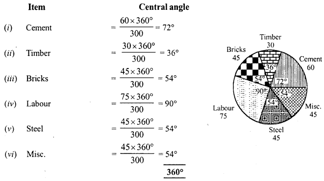
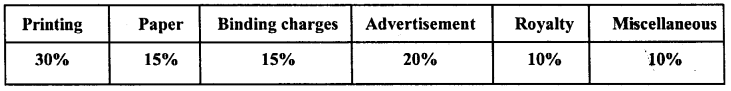
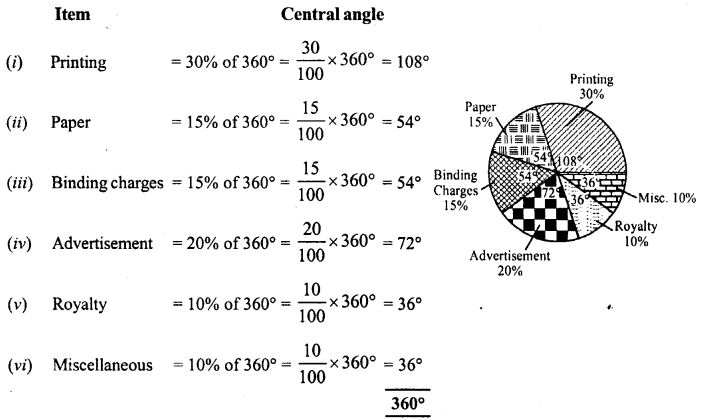
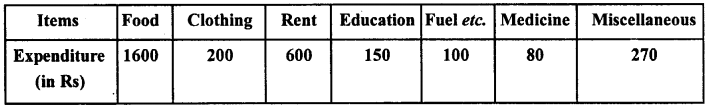
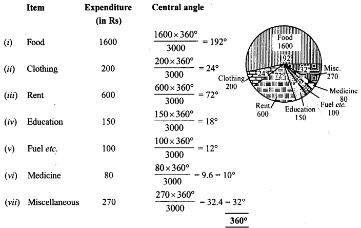
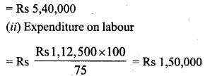
The pie-chart given in figure represents the expenditure on different items in constructing a flat in Delhi. If the expenditure incurred on cement is Rs 1,12,500, find the following:
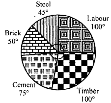
(i) Total cost of the flat,
(ii) Expenditure incurred on labour.
Solution:
Expenditure on cement = Rs 1,12,500
and its central angle = 75°
![]()
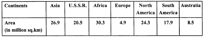
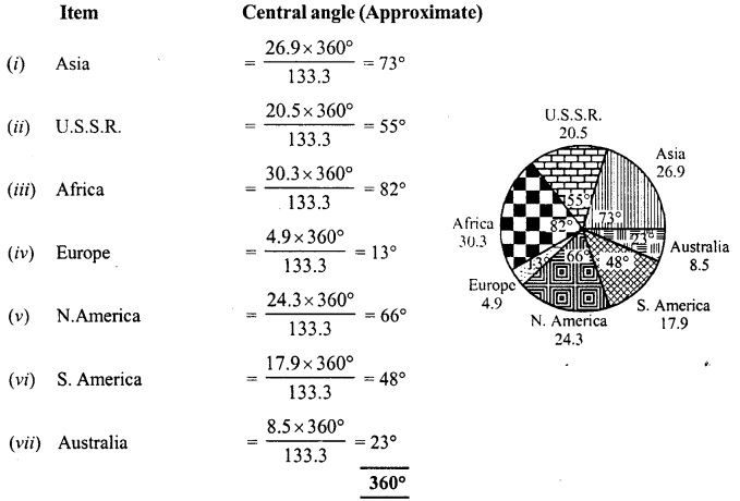
Question 2.
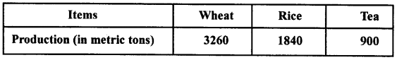
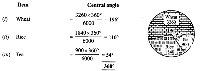
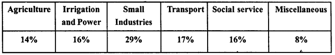
The pie-chart given in the figure shows the annual agricultural production of an Indian state. If the total production of all the commodities is 81000 tonnes, find the production (in tonnes) of:
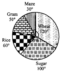
(i) Wheat
(ii) Sugar
(iii) Rice
(iv) Maize
(v) Gram
Solution:
Total production = 81000 tonnes
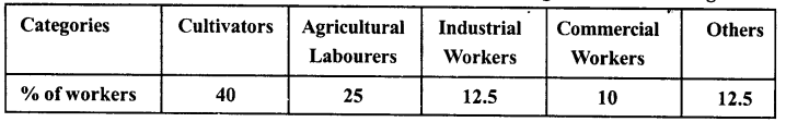
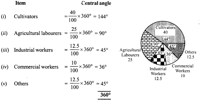
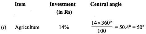
Question 3.
The following pie-chart shows the number of students admitted in different faculties of a college. If 1000 students are admitted in Science answer the following:
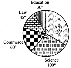
(i) What is the total number of students ?
(ii) What is the ratio of students in science and arts ?
Solution:
Students admitted in science = 1000
Central angle = 100°
(i) Total number of students
∴ Ratio in science and arts = 1000 : 1200 = 5:6
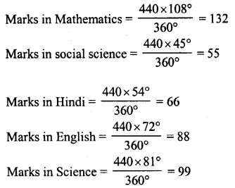
Question 4.
In the figure, the pie-chart shows the marks obtained by a student in an examination. If the student secures 440 marks in all, calculate his marks in each of the given subjects.
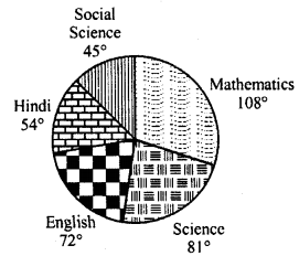
Solution:
Total marks secured by a student = 440
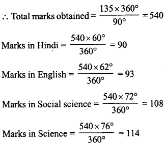
Question 5.
In the figure, the pie-charts shows the marks obtained by a student in various subjects. If the student scored 135 marks in mathematics, find the total marks in all the subjects. Also, find his score in individual subjects.
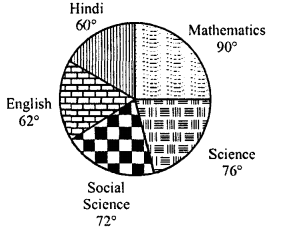
Solution:
Marks obtained in mathematics =135
Central angle = 90°
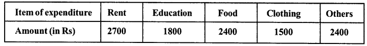
Question 6.
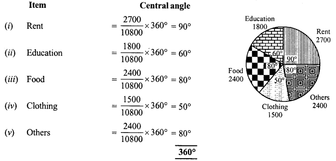
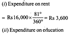
The following pie-chart shows the monthly expenditure of Shikha on various items. If she spends Rs 16,000 per month, answer the following questions:
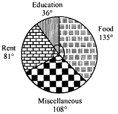
(i) How much does she spend on rent ?
(ii) How much does she spend on education ?
(iii) What is the ratio of expenses on food and rent ?
Solution:
Total expenditure per month = Rs 16,000
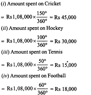
Question 7.
The pie-chart (as shown in the figure) represents the amount spent on different sports by a sports club in a year. If the total money spent by the club on sports is Rs 1,08,000, find the amount spent on each sport.
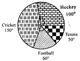
Solution:
total amount spent on sports = Rs 1,08,000
Hope given RD Sharma Class 8 Solutions Chapter 25 Data Handling III Ex 25.2 are helpful to complete your math homework.
If you have any doubts, please comment below. Learn Insta try to provide online math tutoring for you.