RD Sharma Class 9 Solutions Chapter 23 Graphical Representation of Statistical Data Ex 23.1
These Solutions are part of RD Sharma Class 9 Solutions. Here we have given RD Sharma Class 9 Solutions Chapter 23 Graphical Representation of Statistical Data Ex 23.1
Other Exercises
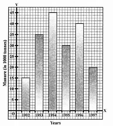
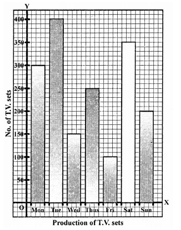
Question 1.
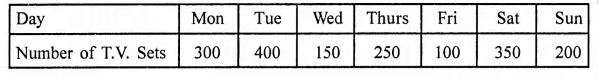
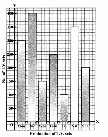
The following table shows the daily production of T.V. sets in an industry for 7 days of a week:
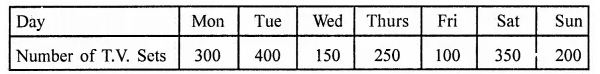
Represent the above information by a pictograph.
Solution:
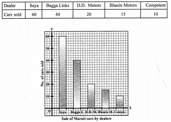
Question 2.
The following table shows the number of Maruti cars sold by five dealers in a particular month:
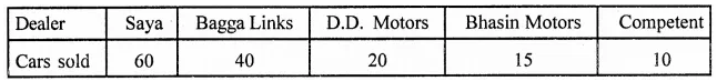
Represent the above information by a pictograph.
Solution:
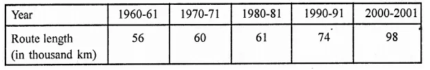
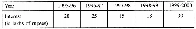
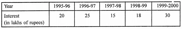
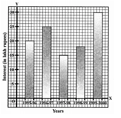
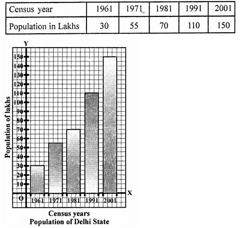
Question 3.
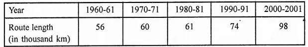
The population of Delhi State in different census years is as given below:
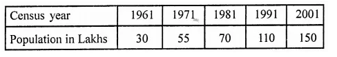
Represent the above information with the help of a bar graph.
Solution:
Question 4.
Read the bar graph shown in Figure and answer the following questions:
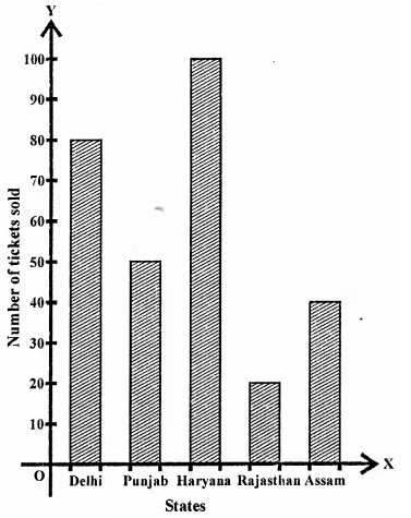
(i) What is the information given by the bar graph?
(ii) How many tickets of Assam State Lottery were sold by the agent?
(iii) Of which state, were the maximum number of tickets sold?
(iv) State whether true or false.
The maximum number of tickets sold is three times the minimum number of tickets sold.
(v) Of which state were the minimum number of tickets sold?
Solution:
(i) Sale of lottery tickets if different states.
(ii) 40 tickets of Assam state lottery were sold.
(iii) Maximum number of lottery tickets were sold of Haryana state.
(iv) Maximum tickets were 100 and minimum = 20 which are not three time. False.
(v) Minimum Lottery tickets of 10 Rajasthan will sold.
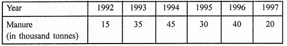
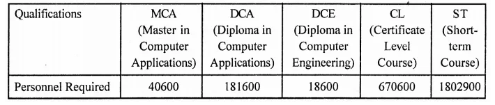
Question 5.
Study the bar graph representing the number of persons in various age groups in a town shown in figure. Observe the bar graph and answer the following questions:
(i) What is the percentage of the youngest age-group persons over those in the oldest age group?
(ii) What is the total population of the town?
(iii) What is the number of persons in the age-group 60-65?
(iv) How many persons are more in the age-group 10-15 than in the age group 30-35?
(v) What is the age-group of exactly 1200 persons living in the town?
(vi) What is the total number of persons living in the town in the age-group 50-55?
(vii) What is the total number of persons living in the town in the age-groups 10-15 and 60-65?
(viii) Whether the population in general increases, decreases or remains constant with the increase in the age-group.
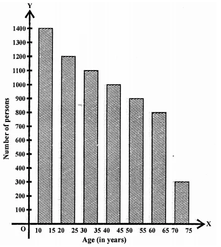
Solution:
(i) Youngest age group = 300 and oldest age group = 1400
(ii) Total population = 1400 + 1200 + 1100 + 1000 + 900 + 800 + 300 – 6700
(iii) In age group of 60-65, number of persons = 800
(iv) Difference of person in the age group 10-15 and of 30-35 = 1400 – 1100 = 300
(v) 1200 persons are in the age group 20-25
(vi) In age group 50-55 number of persons are 900
(vii) Total number of person of the age group 10-15 and
60-65 = 1400 + 800 = 2200
(viii)Population is decreasing with the age-group.
Question 6.
Read the bar graph shown in figure and answer the following questions:
(i) What is the information given by the bar graph?
(ii) What was the number of commercial banks in 1977?
(iii) What is the ratio of the number of commercial banks in 1969 to that in 1980?
(iv) State whether true or false:
The number of commercial banks in 1983 is less than double the number of commercial banks in 1969.
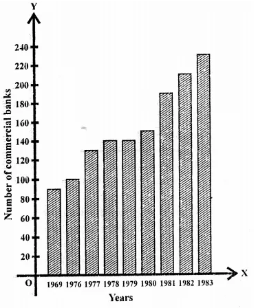
Solution:
(i) The information is number of commercial banks in India during same years.
(ii) In 1977, commercial banks were 130.
(iii) Ratio of banks in 1969 to 1980 = 90 : 150 = 3:5
(iv) Number of banks in 1983 = 230 and number of banks in 1969 = 90
∴ Number of banks in 1983 is less than double the number of banks in 1969 – False.
Question 7.
Given below is the bar graph indicating the marks obtained out of 50 in mathematics paper by 100 students. Read the bar graph and answer the following questions:
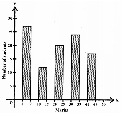
(i) It is decided to distribute work books on mathematics to the students obtaining less than 20 marks, giving one workbook to each of such students. If a work book costs T5, what sum is required to buy the work books?
(ii) Every student belonging to the highest mark group is entitled to get a prize of ? 10. How much amount of money is required for distributing the prize money?
(iii) Every student belonging to the lowest mark-group has to solve 5 problems per day. How many problems, in all, will be solved by the students of this group per day?
(iv) State whether true or false. .
(a) 17% students have obtained marks ranging from 40 to 49.
(b) 59 students have obtained marks ranging from 10 to 29.
(v) What is the number of students getting less than 20 marks?
(vi) What is the number of students getting more than 29 marks?
(vii) What is the number of students getting marks between 9 and 40?
(viii)What is the number of students belonging to the highest mark group?
(ix) What is the number of students obtaining more than 19 marks?
Solution:
(i) Students getting less than 20 marks = 27 + 12 = 39
Cost of 1 work book = ₹5
∴ Total cost = 39 x 5 = ₹195
(ii) No. of students getting highest mark group = 17
∴ Amount paid at the rate of Rs. 10 to each = 10 x 17 = Rs. 170
(iii) Lowest mark group = 27
∴ Total number of problems given = 27 x 5 = 135
(iv) (a) True (b) False
(v) No. of students getting less then 20 marks = 27 + 12 = 39
(vi) Students getting more than 29 marks = 24 + 17 = 41
(vii) Students getting marks between 9 and 40 = 12 + 20 + 24 = 56
(viii) Students to the highest mark group = 17
(ix) Students setting more than 19 marks = 20 + 24 + 17 = 61
Question 8.
Read the following bar graph and answer the following questions:
(i) What is the information given by the bar graph?
(ii) State each of the following whether true or false.
(a) The number of government companies in 1957 is that of 1982 is 1 : 9.
(b) The number of government companies have decreased over the year 1957 to 1983.
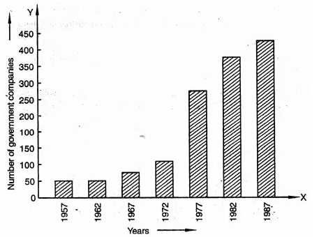
Solution:
(i) Number of government companies in India during some years.
(ii) (a) False (b) False
(a) 50 : 400 = 1:8 and (b) companies are increasing not decreasing.
Question 9.
Read the following bar graph and answer the following questions:
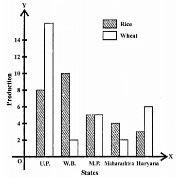
(i) What information is given by the bar graph?
(ii) Which state is the largest producer of rice?
(iii) Which state is the largest producer of wheat?
(iv) Which state has total production of rice and wheat as its maximum?
(v) Which state has the total production of wheat and rice minimum?
Solution:
(i) Production of rice and wheat in different states of India.
(ii) West Bengal is the largest state of production of rice.
(iii) Largest producer of wheat is U.P.
(iv) Maximum production of wheat and rice is U.P.
(v) Minimum production of wheat and rice is Maharashtra.
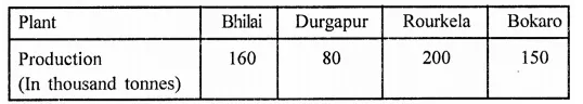
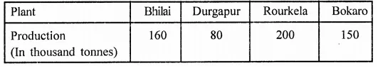
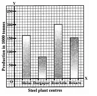
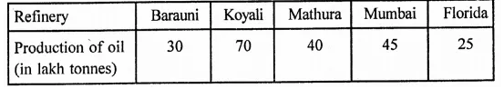
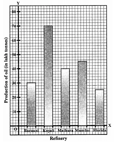
Question 10.
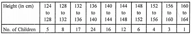
The following bar graph represents the heights (in cm) of 50 students of Class XI of a particular school. Study the graph and answer the following questions:
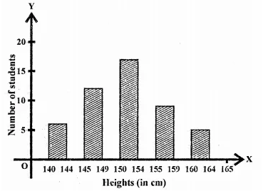
(i) What percentage of the total number of students have their heights more than 149 cm?
(ii) How many students in the class are in the range of maximum height of the class?
(iii) The school wants to provide a particular type of tonic to each student below the height of 150 cm to improve his height. If the cost of the tonic for each student comes out to be Rs. 55, how much amount of money is required?
(iv) How many students are in the range of shortest height of the class?
(v) State whether true or false:
(a) There are 9 students in the class whose heights are in the range of 155-159 cm.
(b) Maximum height (in cm) of a student in the class is 17.
(c) There are 29 students in the class whose heights are in the range of 145-154 cm.
(d) Minimum height (in cm) of a student is the class is in the range of 140-144 cms.
(e) The number of students in the class having their heights less than 150 cm is 12.
(f) There are 14 students each of whom has height more than 154 cm.
Solution:
(i) No. of students having more than height of 149 cm = 17 + 9 + 5 = 31
Percentage = \(\frac { 31 }{ 50 }\) x 100 = 62%
(ii) No. of students in the range of maximum height = 5
(iii) No. of students below the height of 150 cm = 7 + 12 = 19
Cost of tonic for each student = ₹55
∴ Total cost = ₹55 x 19 = ₹1045
(iv) No. of students in the shortest height = 7
(v) (a) True
(b) False
(c) True
(d) True
(e) False
(f) True
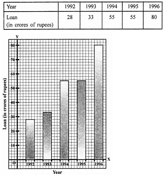
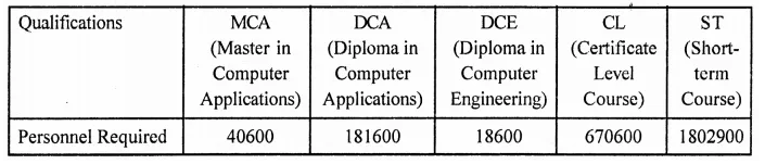
Question 11.
Read the following bar graph and answer the following questions:
(i) What information is given by the bar graph?
(ii) What was the production of cement in the year 1980-81?
(iii) What is the minimum and maximum productions of cement and corresponding years?
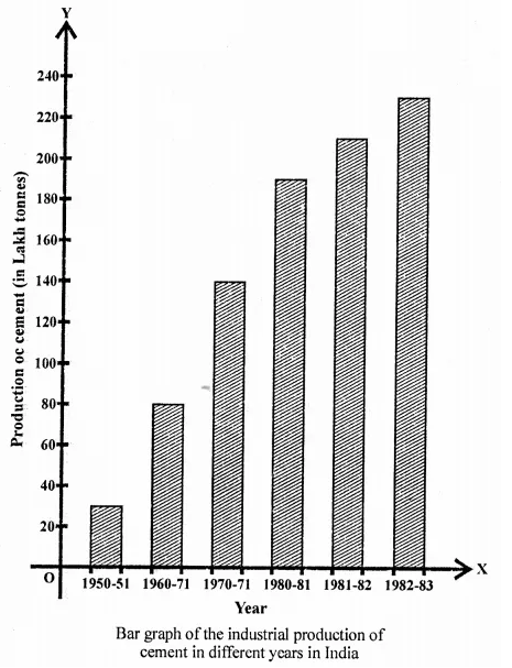
Solution:
(i) Industrial production of cement in different years in India.
(ii) In the year 1980-81, the production was 186 lakh tonnes.
(iii) Minimum production was 30 lakh tonnes in 1950-51 and maximum production was 232 lakh tonnes in 1982-83.
Question 12.
The bar graph shown in the figure represents the circulation of newspapers in 10 languages. Study the bar graph and answer the following questions:
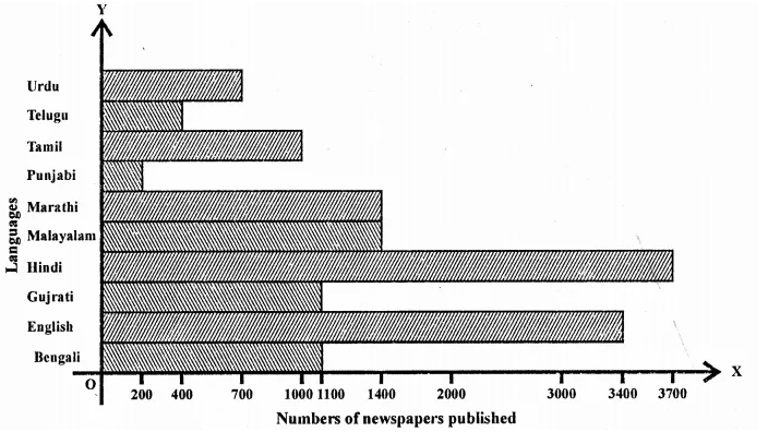
(i) What is the total number of newspapers published in Hindi, English, Urdu, Punjabi and Bengali?
(ii) What percent is the number of news papers published in Hindi of the total number of newspapers?
(iii) Find the excess of the number of newspapers published in English over those published in Urdu,
(iv) Name two pairs of languages which publish the same number of newspapers.
(v) State the languages in which the smallest number of newspapers are published.
(vi) State the language in which the largest number of newspapers are published.
(vii) State the language in whih the number of newspapers published is between 2500 and 3500.
(viii)State whether true or false:
(a) The number of newspapers published in Malayalam and Marathi together is- less than those published in English.
(b) The number of newspapers published in Telugu is more than those published in Tamil.
Solution:
(i) Total number of newspapers in Hindi, English, Urdu, Punjabi, and Bengali
= 3700 + 3400 + 700 + 200 + 1100 = 9100
(iii) Difference in English and Urdu = 3400 – 700 = 2700
(iv) Malayalam and Marathi, Bengali and Gujrati
(v) Punjabi (200)
(vi) Hindi (3700)
(vii) English (3400)
(viii)(a) True (b) False
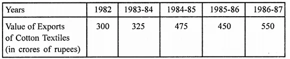
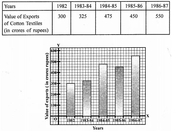
Question 13.
Read the bar graph given in figure and answer the following questions:
(i) What information is given by the bar graph?
(ii) What was the crop-production if rice in 1970-71?
(iii) What is the difference between the maximum and minimum production of rice?
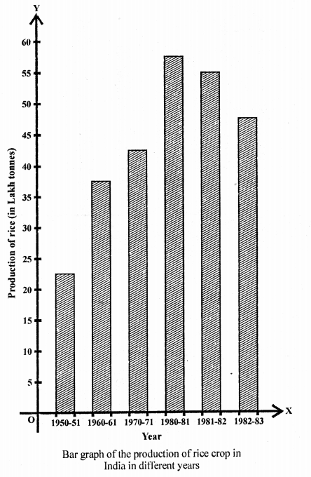
Solution:
(i) Production of rice in India in different years.
(ii) Crop production in 1970-71 was 42.5 lakh tonnes.
(iii) Differences in maximum and minimum production of rice = 55 – 22 lakh tonnes = 33 lakh tonnes
Question 14.
Read the bar graph given in figure and answer the following questions:
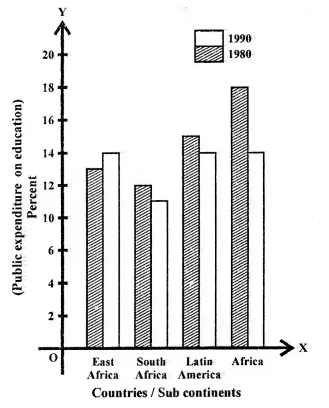
(i) What information does it give?
(ii) in which part the expenditure on education is maximum in 1980?
(iii) In which part the expenditure has gone up from 1980 to 1990?
(iv) In which part the gap between 1980 and 1990 is maximum?
Solution:
(i) Public expenditure on education by vertices sub-continents in 1980 and 1990.
(ii) Maximum expenditure on education in 1980 was in Africa.
(iii) The expenditure from 1980 to 1990 was gone up in East Africa.
(iv) Maximum gap between 1980 and 1990 was in Africa.
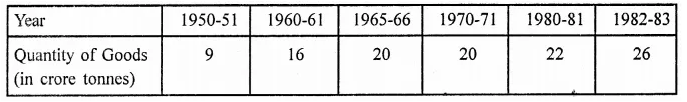
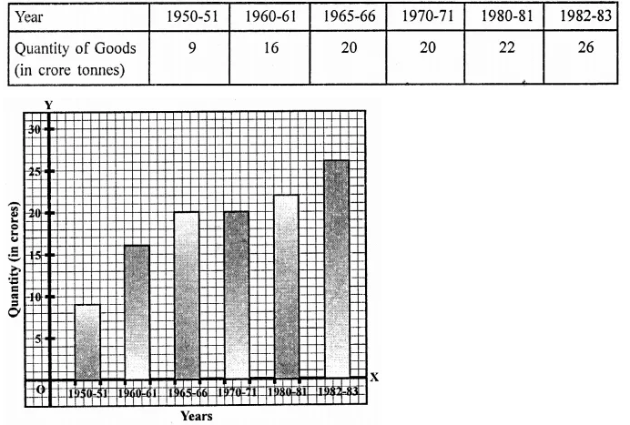
Question 15.
Read the bar graph given in the figure and answer the following questions:
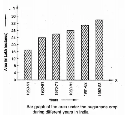
(i) What information is given by the bar graph?
(ii) In whicli years the areas under the sugarcane crop were the maximum and the minimum?
(iii) State whether true or false:
The area under the sugarcane crop in the year 1982-83 is three times that of the year 1950-51.
Solution:
(i) Areas under sugarcane crop during different years in India.
(ii) Maximum sugarcane crop was in 1982-83 and minimum in 1950-51.
(iii) False.
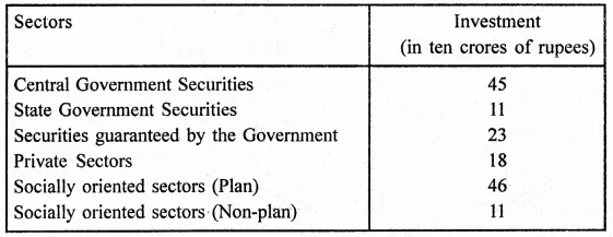
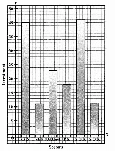
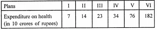
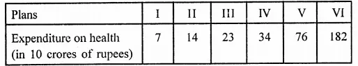
Question 16.
Read the bar graph given in the figure and answer the following questions:
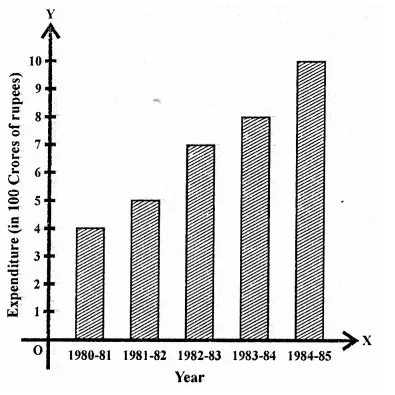
(i) What information is given by the bar graph?
(ii) What was the expenditure on health and family planning in the year 1982-83?
(iii) In which year is the increase in expenditure maximum over the expenditure in previous year? What is the maximum increase?
Solution:
(i) Expenditure on health and family planning sixth five year plan in India.
(ii) Expenditure during 1982-83 was 700 crore of rupees.
(iii) Maximum increase in 1984-85 was them in previous year and difference 10.2 – 8 = 220 crores.
Question 17.
Read the bar graph given in the figure and answer the following questions:
(i) What is the information given by the bar graph?
(ii) What is the number of families having 6 members?
(iii) How many members per family are there in the maximum number of families? Also tell the number of such families.
(iv) What are the number of members per family for which the number of families are equal? Also, tell the number of such families?
Solution:
(i) Number of families with different number of members in a locality.
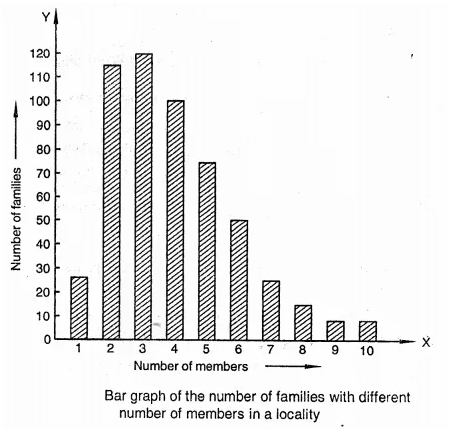
(ii) Number of families having 6 members are 50.
(iii) Maximum number of families are of 3 members family and there are 120.
(iv) Number of families having 9 members and having 10 members are equal and each is 5.
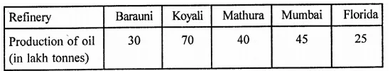
Question 18.
Read the bar graph given in the figure and answer the following questions:
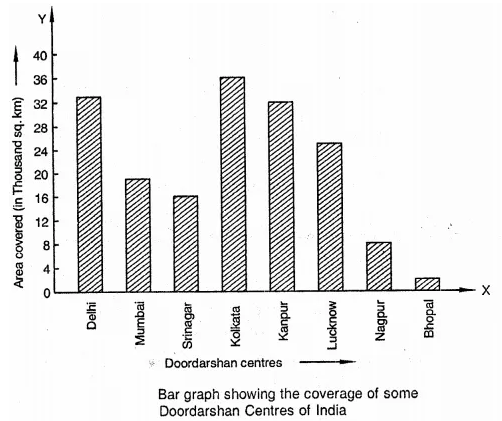
(i) What information is given by the bar graph?
(ii) Which Doordarshan centre covers maximum area? Also tell the covered area.
(iii) What is the difference between the areas covered by the centres at Delhi and Bombay?
(iv) Which Doordarshan centres are in U.P. State? What are the areas covered by them?
Solution:
(i) Coverage of some Doordarshan centres of India.
(ii) Doordarshan kender Kolkata covers maximum area which is 36000 sq. km.
(iii) Difference of areas covered by Delhi and Bombay centres = 32000 – 18000 = 14000 sq. km.
(iv) In U.R Doordarshan centres are Kanpur (32000 sq. km) and Lucknow (25000 sq. km).
Hope given RD Sharma Class 9 Solutions Chapter 23 Graphical Representation of Statistical Data Ex 23.1 are helpful to complete your math homework.
If you have any doubts, please comment below. Learn Insta try to provide online math tutoring for you.