Here we are providing Class 12 Geography Important Extra Questions and Answers Chapter 3 Graphical Representation of Data. Geography Class 12 Important Questions are the best resource for students which helps in class 12 board exams.
Class 12 Geography Chapter 3 Important Extra Questions Graphical Representation of Data
Graphical Representation of Data Important Extra Questions Short Answer Type
Question 1.
What are statistical diagrams ? Describe the different types of statistical diagrams.
Answer:
Statistical Diagrams. In geography, data is used to support maps. The data is given in tabular form. But certain diagrams drawn to show this data are called statistical diagrams. These diagrams give a visual impression to the mind. These are useful for contrasts and comparisons. Certain symbols and geometrical figures are used to draw these diagrams.
Types of statistical diagrams. The following are the main types of statistical diagrams :
(i) Bar graphs
(ii) Line graphs
(iii) Pie graphs
(iv) Rectangular diagrams.
(i) Bar graphs. In this diagram, the quantities are shown by bars of equal width. The length of bars is proportional to the quantities. A suitable scale is chosen to draw these bars. The scale depends upon the maximum figures, minimum figures and the size of the paper. These are easy to draw. These can be easily sub-divided.
Types of Bar Graphs.
- Horizontal Bars. These are simple bars showing total value of only one element during different years.
- Vertical Bars. Vertical columns drawn on the base line are called vertical bars or pillar diagrams.
- Compound Bars. When a single bar showing total value is sub-divided to show more than one element, it is called a compound bar.
- Percentage Bars. A single bar is drawn to represent 100 per cent. It is sub-divided to show different parts in percentage.
(ii) Line Graphs. When data is represented by graphs, it is known as line graph. It involves the drawing of smooth or curved lines. Each point is determined by two co-ordinates. Base line shows zero. The vertical scale (y-axis) shows quantities and the horizontal line (x-axis) shows time. When a line graph shows a continuous variable, the points are connected with a curve (such as temperature).
If it shows a non- continuous variation, the points are joined with short straight lines. Line graphs are notable for their accuracy. These are used for showing climatic data such as temperature, pressure, growth of population, agricultural production, etc.
(iii) Pie Graphs. It is also known as wheel diagram or coin diagram. A pie graph is a circle divided into different sectors. The basic underlying principle is that the area of the circle is proportional to the total quantity. The angle for each sector can be calculated by the following rule:
Angle for each Sector Angle for each Sector \(\frac{\text { Required quantity }}{\text { Total }} \times 360\)
[.’. A circle subtends an angle of 360° at its centre] It is effectively used for showing comparisons. These occupy less space and are useful for distribution maps.
4. Rectangular Diagrams. A rectangle is a two dimensional diagram. When rectangles are used to show the total quantity and its components, it is called a rectangular diagram. The area of each rectangle is proportional to quantity it represents. The length and breadth of each rectangle is calculated according to a scale. It is better to begin with the largest rectangle and other rectangles are drawn inside it. These occupy less space and are useful for comparisons.
Question 2.
What are the advantages and limitations of statistical diagrams ?
Answer:
Advantages
- It is an effective and attractive method of showing data and distribution. It gives a visual impression to the mind at a glance.
- It is easy to construct these diagrams.
- These give comparison between different set of data.
- It is easy to remember these for a long time.
- These diagrams help in analysis of some elements.
- A layman can easily understand these.
- It saves time.
- These give a pattern of general picture.
Limitations
- The data should be accurate.
- These cannot substitute data.
- Many elements can not be shown on one diagram.
- When there is a great variation in maximum and minimum figures, these can not be drawn.
- Sometimes these give wrong and distorted impressions.
Question 3.
Describe the precautions to be used for drawing bar diagrams.
Answer:
The following rules should be followed while constructing bar diagrams:
- Scale. The scale should not be too large or too small. It depends upon the size of paper, maximum figures and minimum figures.
- Length of Bars. The width of bars remains same, but the length of bars vary according to data.
- Shade. Bars should be shaded after drawing.
- Interval. Some interval is kept between the bars.
- Order of Data. The figures should be arranged in an ascending order.
- These should look attractive.
- Title must be shown.
- These should be simple.
Question 4.
Show the monthly maximum temperature of Hissar and Ambala with the help of line graphs.
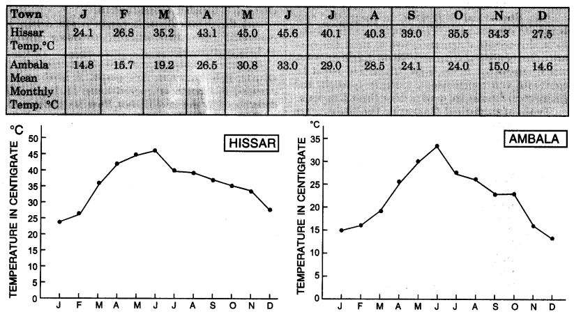
Scale. 5 lines on x-axis = 1 month 1 line on y-axis = 1°C
Answer.
Graph paper is used to show the temperature of the two towns. Draw x-axis and y-axis. Select a scale to show time. 5 lines on x-axis show one month. 1 line on y-axis shows 1°C temperature. Plot 12 points for different months and join these by a curve to show a line graph.
Question 5.
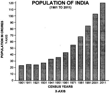
Show the following data by vertical bars. Population of India (1901 to 2011)
Answer:
| Census Year | Population | Census year | Population |
| 1901 | 23,83,96,327 | 1961 | 43.92.34,771 |
| 1911 | 25,20.93.390 | 1971 | 54,81,59,652 |
| 1921 | 25,13,21,213 | 1981 | 68,38,10,051 |
| 1931 | 27,89,77,238 | 1991 | 84,39,30,86 |
| 1941 | 31.10.88,090 | 2001 | 1,02,70,15,247 |
| 1951 | 36,10,88,090 | 2011 | 1,21,01,93,422 |
Construction:
(i) Make round figure for population. Show the years on x-axis taking a suitable scale.
(ii) Draw vertical lines on ends of x-axis.
(iii) On the left hand side, select a scale of 1″:10 crores to show population.
(iv) Find out the height of bars for different years.
(v) Shade the bars.
| Census year | Population (in crore) | Height of Bars (inches) |
| 1901 | 23.8 | 2.4″ |
| 1911 | 25.2 | 2.5″ |
| 1921 | 25.1 | 2.5″ |
| 1931 | 27.9 | 2.8″ |
| 1941 | 31.1 | 3.1″ |
| 1951 | 36.1 | 3.6″ |
| 1961 | 43.9 | 4.4″ |
| 1971 | 54.8 | 5.5″ |
| 1.981 | 68.3 | 6.8″ |
| 1991 | 84.4 | 8.4″ |
| 2001 | 102.7 | 10.3″ |
| 2011 | 121.0 | 12.1″ |
Question 6.
Show the following data by multiple bars. Sex-wise population and Total population of India (in crores)
Answer:
| Census Year | Male | Female | Total |
| 1971 | 28.41 | 26.41 | 54.82 |
| 1981 | 35.33 | 33.00 | 68.33 |
| 1991 | 43.88 | 40.75 | 84.64 |
| 2001 | 53.13 | 49.57 | 102.70 |
| 2011 | 62.37 | 58.64 | 121.01 |
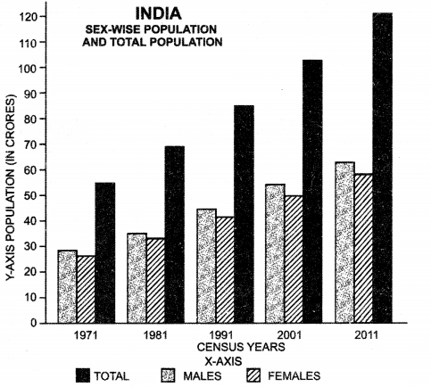
Construction.
(i) On x-axis select a suitable scale. Draw three vertical bars each for a year.
(ii) On y-axis select a scale of 1″ = 10 crores of population and find out the height of different bars.
(iii) Shade the bars showing males, females and total population with different shades and show an index for these.
Question 7.
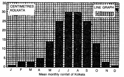
Show the following mean monthly rainfall data of Kolkata by Bar-diagrams.
| J | F | M | A | M | J | J | A | S | 0 | N | D | |
| Rainfall (cms.) | 1 | 3 | 3 | 5 | 14 | 25 | 30 | 30 | 25 | 13 | 3 | 1 |
Answer:
Method
Show the twelve months along the base line. Draw a vertical line to show the vertical scale showing rainfall in centimetres. (1 line = 1 cm. of Rainfall). Draw vertical bars and shade them black.
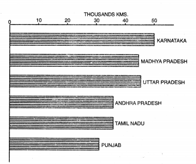
Question 8.
Show the following data by Bar diagram:
INDIA—Metalled Roads
| State | Length of Metalled Roads (in kms.) |
| 1. Karnataka | 49,743 |
| 2. Madhya Pradesh | 45,756 |
| 3. U.P. | 45,361 |
| 4. Andhra Pradesh | 35,714 |
| 5. Tamil Nadu | 35,138 |
| 6. Punjab | 31,862 |
Answer:
Method
Draw a horizontal base line. Show a suitable scale on it keeping in mind the highest and the lowest figures. Select a scale 1 cm. = 10,000 kms. of metalled Road. Calculate the length of the bars representing different states. Draw horizontal bars of uniform width, parallel to the base line.
Question 9.
Show the following data with the help of Compound Bars.
INDIA—Foreign trade (in Crores of Rupees)
| Year | Export | Import | Total |
| 1990-91 | 32,553 | 43,198 | 75,751 |
| 1995-96 | 1.06,353 | 1.22,678 | 2,29,031 |
| 2000-01 | 2,03.571 | 2,30,873 | 4,34,444 |
| 2005-06 | 4,56,418 | 6,60,409 | 11,16,827 |
| 2010-11 | 11,42,649 | 16,83,467 | 28,26,116 |
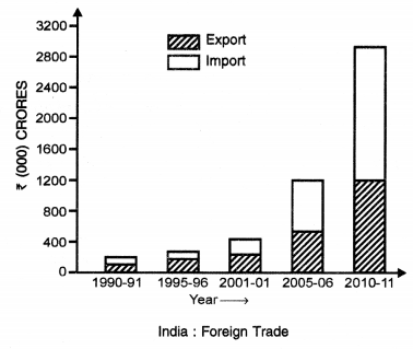
Answer:
Method
Show the different years on horizontal base line (X-axis). Select a suitable scale i.e., 1 cm = ? 5000 crores. Draw a scale on the vertical line (Y-axis) on the left hand side of the base line. Calculate the height of each column according to the scale. Draw these vertical bars of equal width. Sub-divide each bar into two parts showing imports and exports. Draw an index to show the shades.
Question 10.
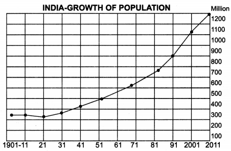
Show the following Data with the help of a line graph :
INDIA—-Growth of Population
| Year | Population (in Million) | Year | Population (in Million) |
| 1901 | 238 | 1961 | 439 |
| 1911 | 252 | 1971 | 548 |
| 1921 | 251 | 1981 | 683 |
| 1931 | 279 | 1991 | 844 : |
| 1941 | 319 | 2001 | 102.8 |
| 1951 | 361 | 2011 | 121.0 |
Answer:
Method
Show the different years on the X-axis. Show a vertical scale on the left hand side selecting a scale of 1 cm. = 100 million people. Population of each year is plotted by determining the co-ordinates along X-axis and Y-axis. The points thus marked are joined by a straight line.
Question 11.
Represent the following data of mean monthly temperature and rainfall of Mumbai with the help of compound line graph.
Answer:
| J | F | M | A | M | J | J | A | S | 0 | N | D | |
| Temp. °C | 22.5 | 22.5 | 27 | 28 | 30 | 29 | 28 | 28 | 28 | 27 | 26 | 25 |
| Rainfall (cms.) | 2 | 2 | X | X | 4 | 50 | 60 | 36 | 26 | 6 | 4 | X |
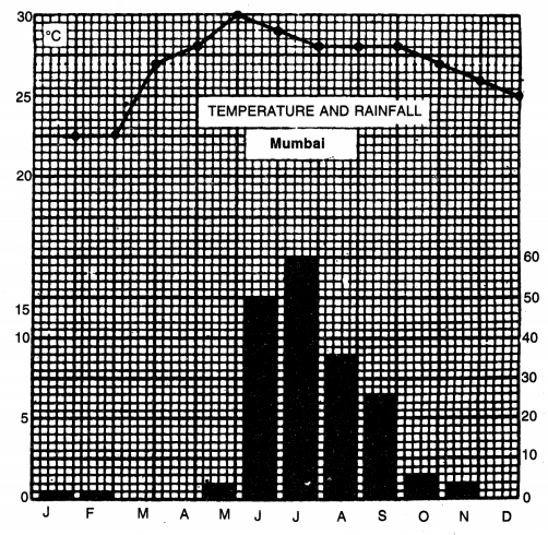
Method
When a line graph and a bar diagram are combined to show temperature and rainfall of a place together, it is known as a compound line graph. Draw a base line on a graph paper. Show different months on it with the help of a horizontal scale. Draw vertical line at both ends of the base line. These lines show the vertical scales for temperature and rainfall. 1 square shows 5°C temperature while 1 square shows 20 cm. rainfall. Plot the temperature curve. Show the rainfall with the help of bar diagrams.
Question 12.
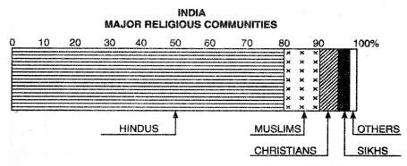
Show the following data with the help of percentage and pie graphs.
Major Religious Communities in India (1991)
| Religion | Percentage of total population |
| 1. Hindus | 82.41 |
| 2. Muslims | 11.67 |
| 3. Christians | 2.32 |
| 4. Sikhs | 1.99 |
| 5. Others | 1.61 |
| Total | 100.00 |
Method.
Draw a line 10 cm. long. Draw a simple bar of any suitable length. Show a scale of percentage on it (1 cm. = 10%). The bar shows total quantity of 100 per cent. Calculate the length of different religions according to the scale. Show the different religions with different shades.
By Pie graphs. Pie graph is a circle broken down into sectors. For finding out the angle of each sector, the following rule is used.
Pie Diagram Showing Population by Religion in India, 1991
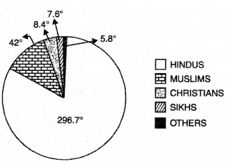
\(\text { Angle }=\frac{\text { Required Quantity }}{\text { Total }} \times 100\)
In other words, the percentage figure is multiplied by 3.6° to get the angle. By this method, for Hindus the angle is 296.7°, for Muslims the angle is 42°, for Christians the angle is 8.4°, for Sikhs the angle is 7.1° and for others it is 5.8°.
Question 13.
Write a note on flow diagrams.
Answer:
Flow diagrams show the movement and intensity of different elements. These are based on two elements;
(i) Direction of movement
(ii) Intensity of movement.
For example.
(i) To show number of vehicles on Rail-Road Routes
(ii) Wheat, Steel, Cargo, etc.
(iii) Import – Export trades.
Merits-demerits. The comparative importance of all the routes are shown on one map. The towns where these routes converge, become important. The flow diagrams show the sphere of influence of nodal town.
Example. The following table shows the frequency of buses moving from Panipat to different stations.
Number of Buses moving from Panipat
| To Town | Number of Buses |
| Kamal | 70 |
| Delhi | 50 |
| Rohtak | 20 |
| Ambala | 90 |
| Jind | 25 |
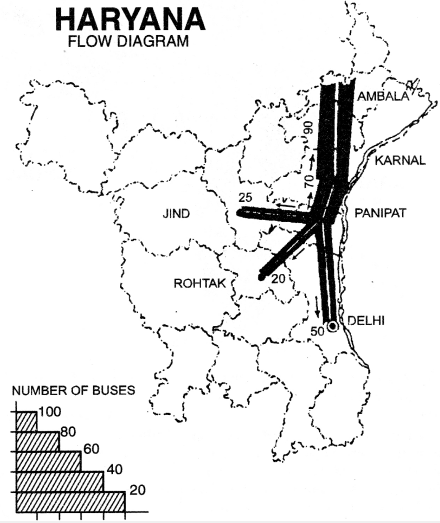
(i) Show the location of all the towns on an outline map of Haryana.
(ii) Show the road routes.
(iii) Show the thickness of routes according to scale selected.
(iv) Show arrows for direction on all routes.
(v) Draw the scale also.
Question 14.
What are distribution maps? What are the requirements for preparing a dot map? Describe the merits and demerits of dot method.
Answer:
Distribution Maps. Distribution maps show the real distribution of different elements such as density of population, livestock, crops, minerals, etc. These show the variations in the value, amount or density of different elements. Different symbols or colours are used to draw these maps.
These maps help the geographer in the study of the economic geography. These help the geographer to study the cause and effect of any distribution and give a visual impression. Such maps are thus useful for educational purpose and are of two types:
(i) Quantitative Maps. Such as dot maps, isopleths.
(ii) Qualitative Maps. Such as chorochromatic maps, colour method.
Dot Method. Dot is the simplest kind of symbol used for showing distribution maps. Dot of uniform size show the distribution of crops, population, livestock, etc. Each dot has a specific value. The number of dots is calculated for the total quantity shown on the map.
Requirements for preparing a dot map
- An outline map of the region showing boundaries of administrative units.
- Definite and detailed data of the element.
- Relief map of the area.
- A climatic map showing temperature and rainfall.
- A soil map of the area.
- A topographical map showing urban and rural settlements.
Problems of Dot method
(i) Value of a dot. Scale of value of a dot should be carefully chosen. The selection of scale depends upon maximum figures, minimum figures and the size of the map. Dots should not be too many or too few.
(ii) Placing of dots. Dots should not be placed over negative areas such as marshes, deserts, etc. Dots should not merge together and should be placed at the centre of gravity of the area such as Urban Towns in case of population maps.
(iii) Size of dots. Dots should be round and of uniform size. The size of dots depends upon the size of the map and number of dots.
Merits
(i) This method is quantitative as well as qualitative.
(ii) In this method, waste land can be avoided.
(iii) This method gives a visual impression to the mind and is useful for educational purposes.
(iv) Pattern of dots faithfully reflect the distribution of an element.
(v) It is easily commensurable and can be transferred into a choropleth map or an isopleth map.
Demerits
(i) This method cannot be used for showing relations and percentages.
(ii) These show only one element on map.
(iii) These maps can not be used for scientific purposes.
Question 15.
What are choropleth maps ? Explain its principle, merits and demerits.
Answer:
Choropleth Maps. In this method, the distribution of an element is shown by different shades.
So it is also known as shading method. An index is shown in one corner of the map showing scheme of different shades.
Principle. Generally, black and white shading is used. This is somewhat similar to colour or tint method. The density of shading is proportional to the intensity of the value of the element. The lighter shades show’ the lower densities while the deeper shades show higher densities.
The depth of shading can be increased by enlarging the dots, thickening the lines or bringing the lines close together.
Problems
(i) Choice of administrative unit. Generally, data is based on administrative units which should be carefully selected.
(ii) Choice of interval. It is necessary to group data into categories. So we select an interval between these categories and it is called scale of densities. Too many categories can be confusing w’hereas too few can be uneffective.
Merits
(i) It is useful for average figures or percentages.
(ii) It is used for showing density of population, yields of crops, land use and ethnic group of population.
(iii) This method is somewhat similar to colour method and give a visual impression to the mind.
(iv) Choropleth maps are the chief tool of human geographer.
Demerits
(i) In this method, the distribution shown is uniform over the whole area and no account is taken of waste lands.
(ii) The boundaries of shading do not follow the exact line of variation.
(iii) These maps do not give absolute figures.
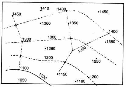
Question 16.
What are isopleths ? Name its different types. How are these prepared ? Describe their merits and demerits.
Answer:
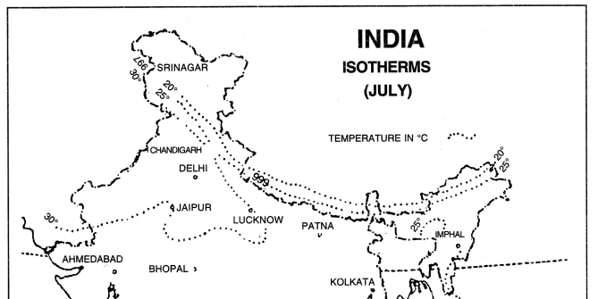
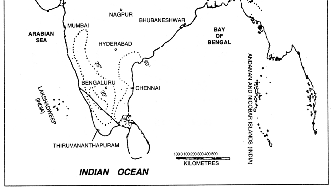
Isopieths. Isopieths are imaginary lines of equal value, in the form of quantity, intensity and density. The word isos means equal and plethron means measure. Therefore, isopleths are lines of equal value. These lines connect all the places with similar values.
Types of isopleths. Different elements are shown by different types of isopleths.
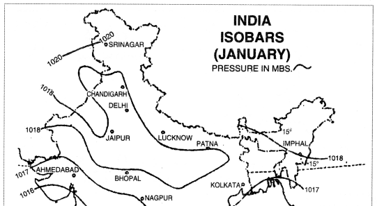
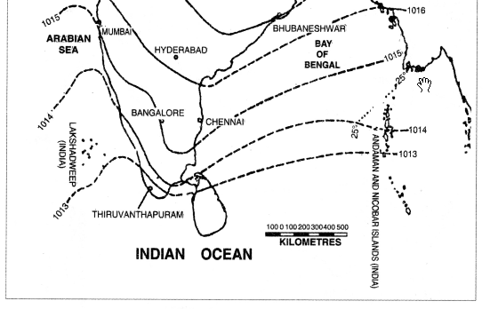
- Isobars. Isobars are lines joining the places of same pressure reduced to sea level.
- Isotherms. Isotherms are lines joining the places of same temperature reduced to sea level.
- Isohyets. Isohyets are the lines joining the places of same rainfall.
- Contours. Contours are lines joining the places of same height above mean sea level.
- Isonephs. Isonephs are lines joining the places of same cloudiness.
- Others. Isobath, isohalines, isoseismal, isohets are other examples.
Drawing of Isopieths
- Draw an outline map of the area. Mark all the places on it.
- Data should be available for all these places.
- Select a suitable interval for the map according to maximum and minimum figures.
- The selection of interval depends upon the rate of variation of an element. The isopieths show a mild rate of change when these are apart, but show a steep change when these are close.
- Isopieths are drawn as smooth lines by joining the points with same values; otherwise, isopieths are interpolated proportionately between the values plotted on the map.
- Sometimes, the area between two-isopieths are shaded.
Merits
(i) Isopieths show accurately the values of rainfall, temperature, etc.
(ii) These show the actual values present at a place.
(iii) It is a scientific method of showing these elements.
(iv) Dot map and choropleth maps can be converted into isopleth maps.
(v) These maps are not related to administrative
Demerits
(i) The interpolation of isopleths is a difficult process.
(ii) If sufficient data is not available, isopleths cannot be drawn.
(iii) If isopleths show steep variation, these maps are not meaningful.
(iv) These fail to show the urban and rural population on the same map.
Uses
(i) These are useful for showing climatic data.
(ii) These are used to show ratios and percentages also.
(iii) These maps are used to show 7 population maps, density of population, livestock, yield per hectare, etc.